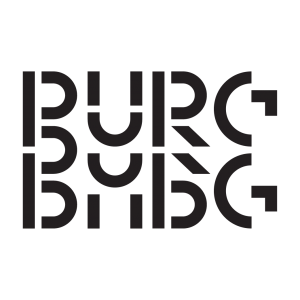
About 66 years ago, the famous Helvetica font was released. Its mission was to create “a neutral typeface that had great clarity, had no intrinsic meaning in its form and could be used on a wide range of signage.” Today, designers are pushing the boundaries of typography more than ever before. New approaches to letter design emerge when neutral, clear and meaningless forms are challenged.
This afternoon’s guests are Benjamin McMillan and Team Thursday.

Photo by Henk WildschutLoes van Esch and Simone Trum together form Team Thursday, a design studio based in Rotterdam. They design visual identities, books and spatial objects. They do so with a special interest in typography, a curiosity about materials and the possible performativity of an object. Searching for patterns in everything and everywhere around them, they look for how to translate them into designs. They also regularly teach typography at ArtEZ in Arnhem and irregularly organize exhibitions and events in the front part of their studio space, TTHQ.
Benjamin McMillan graduated from Artez in Arnhem in 2020. He now works from Amsterdam as an independent designer. He calls himself a “bad type constructor” and loves everything that makes typography bad, ugly and unnatural. The beauty of raw sketchy typography is also the starting point of his Full Auto Foundry, an automated letter design process. During workshops, participants draw analog letterforms without thinking too much. Then sketches are scanned and go through an automated digital process to typeface.


