Poetry is a collection of words, typography is body language. These two disciplines complement each other, while also strengthening and clarifying another. Maud Vanhauwaert describes poetry as a marriage between these two domains. For this project, the Flemish poet collaborated with graphic designer Jelle Jespers. Some of their poems originated from a substantive idea, others from a formal concept. Jelle sees typography as the first introduction to a poem. The way a poem is designed should therefore reflect what the writer wants to say. “Both the choice of a typeface, the setting and the support can make the meaning or the atmosphere stronger,” says Jelle.
Literary artist Jasmine Roemendael collaborated with writer Lisette Ma Neza. With her typography, Jasmine adds an extra layer to Lisette’s words: “A work is more interesting if it also tells something in terms of content. I am always looking for nice sentences, words or poems to illustrate.”

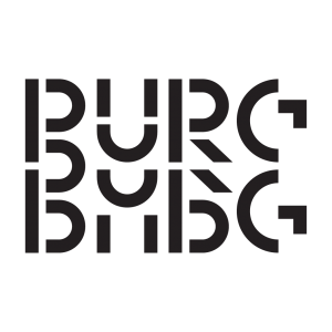
Work by Lisette Ma Neza and Jasmine Roemendael | Photo by Edwin Wiekens
An extra dimension
Usually, with poetry, the words have already been carefully placed on the paper. Custom typography takes this a step further. Just as Van Ostaijen did a hundred years ago, graphic designer Pieter Boels looks for ways to give the message an extra dimension. “If the message also appeals to the imagination as the poetry of Joost Oomen, with whom I worked, it’s a rewarding challenge,” he believes. As a poet, Joost strives to find a new domain. This, he believes, is something Van Ostaijen has certainly succeeded in. “Whether he has done well in doing so is the question, but what is certain is that he has shown a domain where danger, rhythm and image can go hand in hand. This has created a new kind of untamed, wild poetry,” Joost believes.
Bezette Stad contains poems that deal with the German occupation of Antwerp during World War I, in which ‘Boem Paukeslag’ one of the most famous artistic renderings is. Poet Jonathan Griffioen finds that the poems describe Antwerp’s hunger, death and war in an exuberant, sprightly, almost joyful, jazz-like cadence. For this project he collaborated with Loes van Esch and Simone Trum from the Rotterdam design duo Team Thursday. They look for the visual translation of a text, this can result in moving typography or a variable font. During the joint discussions it became clear that Team Thursday and Griffioen both work in a certain intuitive way, from there the confidence to work together on this project was born.

Work by Joost Oomen and Pieter Boels | Photo by Edwin Wiekens
Dare
What’s special about this exhibition is that the typographers and word artists worked together from the very first moment, in order to bring both disciplines together. Graphic designer Pieter Boels finds the collaboration between Van Ostaijen and Jespers undoubtedly groundbreaking. He calls them pioneers in a form of design that he later made his profession: typographic illustration. According to poet Joost Oomen, the two were brave artists who dared to take on the extreme consequences of their artistic views.
Writer Hind Eljadid collaborated for TYYYPOëzie with typographer Kristyan Sarkis, whose work is in Arabic. Kristyan tried to find similarities between his work and Hind’s. That included making bold and powerful statements, which now serves as one of the common denominators for the posters. In Hind’s poems, the rhyme is sometimes in the middle of the sentence. “In the Arabic translations there is no rhyme, but I focused on the music and the rhythm of the letters around it,” Kristyan explains. When Hind recited the poems, it sounded like music to him.
“In an urban environment passers-by are so used to walking by, with our poem we want to make people stop for a moment.” – Maud and Jelle
Look closer
Readability is something that was important to the creators. Poet Maud and graphic designer Jelle tried to create posters that work on both an abstract level as a concrete level. Depending on the position you stand in, you either see the aesthetic abstraction of the graphic, or legible letters. The duo Joost and Pieter wanted it to be a challenge for the reader, they want their creation to excite the viewer to search in the picture. “Passers-by should be intrigued by what’s on the posters, it’s okay if it takes a little effort from them,” says graphic designer Pieter.
The pair Maud and Jelle hope that people feel tempted to come and look a little closer: “In an urban environment passers-by are so used to walking by, with our poem we want to make people stop for a moment.” Writer Elianne van Elderen forms a duo with typographer Aleksandra Samulenkova. Elianne hopes that visitors will become aware of the details and thereby appreciate the little things more.
TYYYPOëzie travels through different locations in the Netherlands and Flenders. The first stop was in Antwerp, followed by Kortrijk. Currently the exhibition is on display in Breda, after which it will move to Eindhoven, Amsterdam and Geel. It is possible that more locations will follow.

Work by Hind Eljadid and Kristyan Sarkis (at the top) and Maud Vanhauwaert and Jelle Jespers (at the bottom) | Photo by Edwin Wiekens
Look for all dates on www.tyyypoezie.online.
TYYYPOëzie is a project of Graphic Matters Foundation and literary platform Watershed.
Participating duo’s:
Maud Vanhauwaert & Jelle Jespers
Elianne van Elderen & Aleksandra Samulenkova
Jonathan Griffioen & Loes van Esch and Simone Trum
Joost Oomen & Pieter Boels
Hind Eljadid & Kristyan Sarkis
Lisette Ma Neza & Jasmine Roemendael