Graphic design is a powerful tool. But for what? The objective purpose of graphic design is of course to be a method of communication with the aim of ‘change’. But what change. And for who? And, also what is the ‘right’ way to use it? Those are pretty profound questions and in no way will they be answered here. Well at least not fully. Nevertheless, let’s at least think about it binarily. Graphic designers have two ways to think about how they want to work in their careers; they can choose to take a walk down one of two paths:
‘Path A’ – Working as a service-provider for commercial clients to help them achieve commercial success (we can refer to this simply as Capitalism) Or… Path B’ – Working as an activist and using visual communication to create social, political, environmental change.
To my knowledge, it’s rare that these two paths properly overlap and in trying to criss-cross between the two, they can get lost; especially new graduates leaving the bubble of university and entering the real world of ‘real graphic design’. It’s easy to get caught in the ethics of what is deemed the ‘right’ and ‘wrong’ way to use these skills whilst also trying to maintain one’s life and get paid; it’s actually probably impossible… The two fight each other as their aims are so far apart and contradict: one is commercially driven, the other, community. This conundrum is captured by Alfonso Matos, in his book Who Can Afford To Be Critical? where he writes: “I TRIED TO SUBVERT CAPITALISM WITH MY DESIGN PRACTICE. NOW I’M LOOKING FOR A JOB.”
For context, I’m not just a writer but I’m also a graphic designer and I’m quite far down the ‘Path A’ now. I work in a branding agency and have done so since I finished university about ten years ago. I have produced work for commercial clients to help grow their businesses – I’m sure making them millions of dollars, pounds and euros – all through the power of design. But that doesn’t mean I’m a bad person, nor does it mean that I’m not interested in taking a wander down ‘Path B’ from time to time. I’m fully aware that I possess the skills, and therefore the power, to choose to work as an activist, and I actually have done so previously (see my Signs of Change project from 2020). Additionally, as I mostly don’t engage in this world, I find listening to those who do, talk about what and why they do, so much more interesting than listening to a famous designer wax lyrical about their wordmark kerning or their logo bezier curves. So, we are not talking about that kind of graphic design today; you’ll find plenty of that, elsewhere.
Instead, we are talking about ‘Path B’ and the sliproad we’ve taken here explores the power of graphic design at the destination of Graphic Matters’ Voices in Type Assembly, specifically looking at activist graphic design under the context of: “The power of graphic design as a social or political voice”. This Assembly brought ten international graphic designers, educators, artists, writers and activists together to the Chassé Theater in Breda, NL. Their work, very much anchored in the ‘Path B’ world for activism – driven by politics, for the design of politics, for or against a specific political cause and/or being politically charged. Featured performances and presentations from: Guido de Boer, Michael Ellsworth & Raya Leary/Civilization, Mark Baker-Sanchez/BakerSanchezInc, Tré Seals/Vocal Type, Kaleena Sales, Saki Mafundikwa, Golnar Kat Rahmani, Beatriz Lozano, Aneesh Bhoopathy/Forge & Ruben Pater/Untold Stories.
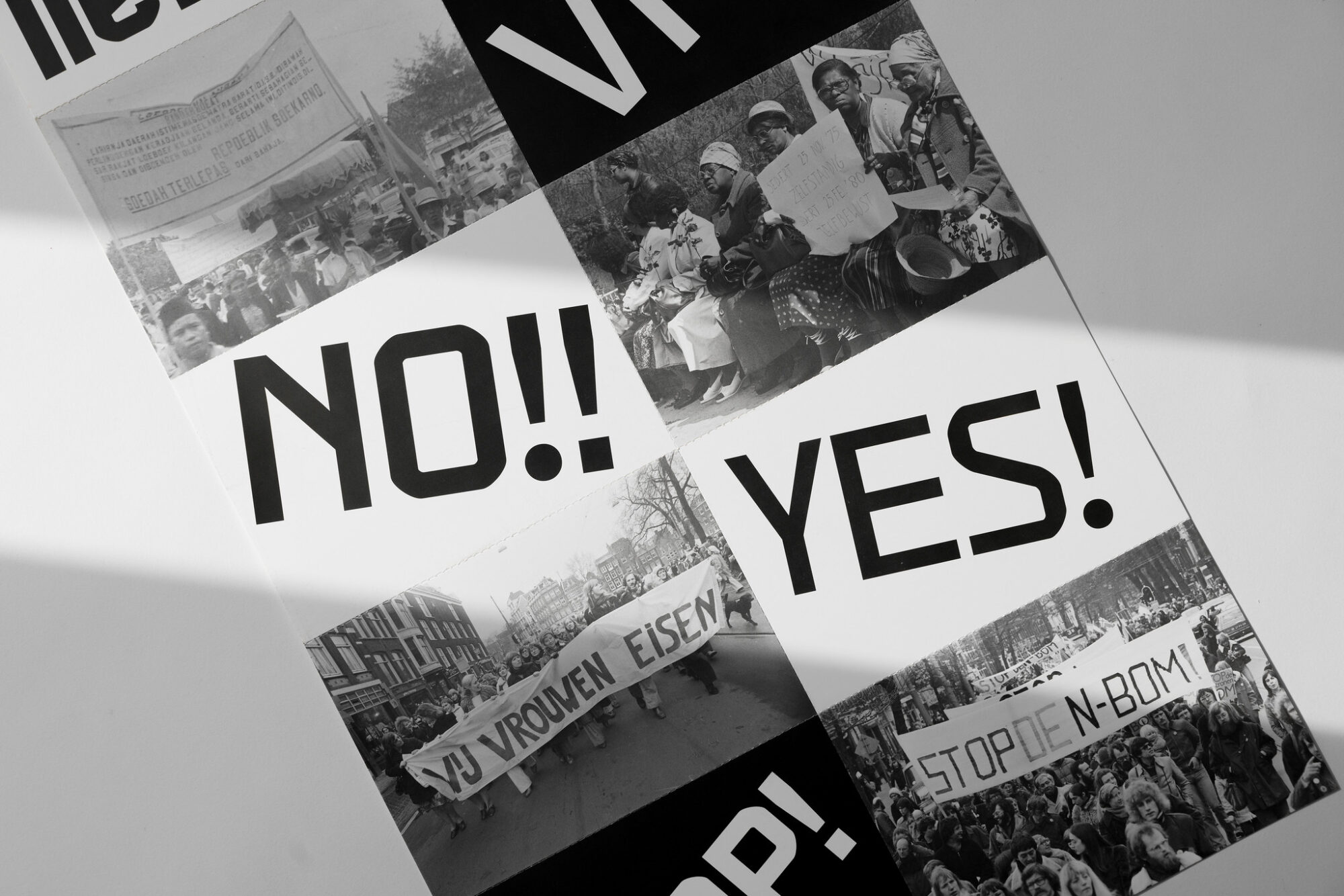
Speaking of design for activism and activist designers, what is activism, really? Activism is defined as “the use of direct and noticeable action to achieve a result, usually a political or social one”. Along with boycotts and civil disobedience, protest marches are how activism gets awareness and makes change, with graphic design serving as the visual vehicle for this… and it has done so for as long as the two have coexisted. During protest marches, there will always be typographic signs – handwritten or typeset (the act of laying out a typeface and words in a design). The messages on these signs in bold ‘fonts’ carry urgency and identity but they are more than fonts and letters, but people’s non–verbal voices. The 18th century French Revolution riots, the American Civil Rights Movement protests, the May 1968 Paris social uprising, the 2020 Black Lives Matter protests and probably at a protest that happened near you today; typography as the amplification of people’s voices has played a central role.
With this in mind, it’s worth considering that typography and typeface design is not just an aesthetic choice. It cannot be neutral. Typography carries the weight of history and the identity of the people it represents. The cross-continental Design studio Civilization (Michael Ellsworth and Raya Leary) understand this and their ongoing Characters project proves it. Characters is first and foremost an exhibition that aims to showcase typefaces from the Vocal Type catalogue. This is relevant to my point because it’s not just an aesthetic exercise (although the typefaces do look great). The typefaces designed by Vocal Type founder, Tré Seals, are heavily conceptual at their heart and have been designed to reflect and honour the struggles of marginalised figures over history. VTC Martin honours civil-rights leader Martin Luther King Jr. and VTC Marsha is inspired by trans-rights activist Marsha P. Johnson, for instance. Both typefaces (and many more) literally take from their respective protest signs. As a designer, choosing to capture and reflect these struggles into the literal construction of typefaces proves that typography and typefaces don’t just communicate a message but that the letters themselves are the message.
But to be effective, activist design and exhibitions like this can’t just be pictures on walls. The context of where and how it’s displayed needs to be considered. For example, when Characters was first exhibited, it was at the Branch Museum of Design in Richmond, Virginia and the format was typeset portraits of these marginalised figures made out of Vocal Type typeface letters. Why is that relevant? Because Richmond was the former capital of the Confederacy so by putting images of these figures that fought against this (and similar regimes) is another form of protest through reclamation. As the exhibition moved onto a more traditional and ‘context-less’ white-wall museum space at the Museum of Design Atlanta (MODA) it needed to adapt and rather than repeating the portraits, Characters used the power of type to take over the space. Editorial designer, Mark Baker Sanchez, himself a fan of Vocal Type and working with marginalised communities, turned the MODA space into an immersive experience, using unapologetically and unmissable floor-to-ceiling typeset letters, words and messages of protest to take over the space, similar to how protestors do when coming together. These words and messages, pulled together by writer Kaleena Sales, who believes that design history is always intertwined with cultural studies. The two are not separate.
Protest and creating a movement, with typography, is never a singular act though; it has to be done through a collective: the power of ‘we’ (although it only takes one person to start a movement). “We demand change” shows a shared struggle and aim. Characters has epitomised this with its latest development as it came to the Netherlands and in Breda. Collaborating with Graphic Matters and following the Vocal Type ethos – together the team created a new tool for, and typeface inspired by context-specific protest in the Netherlands: VTC Wij.
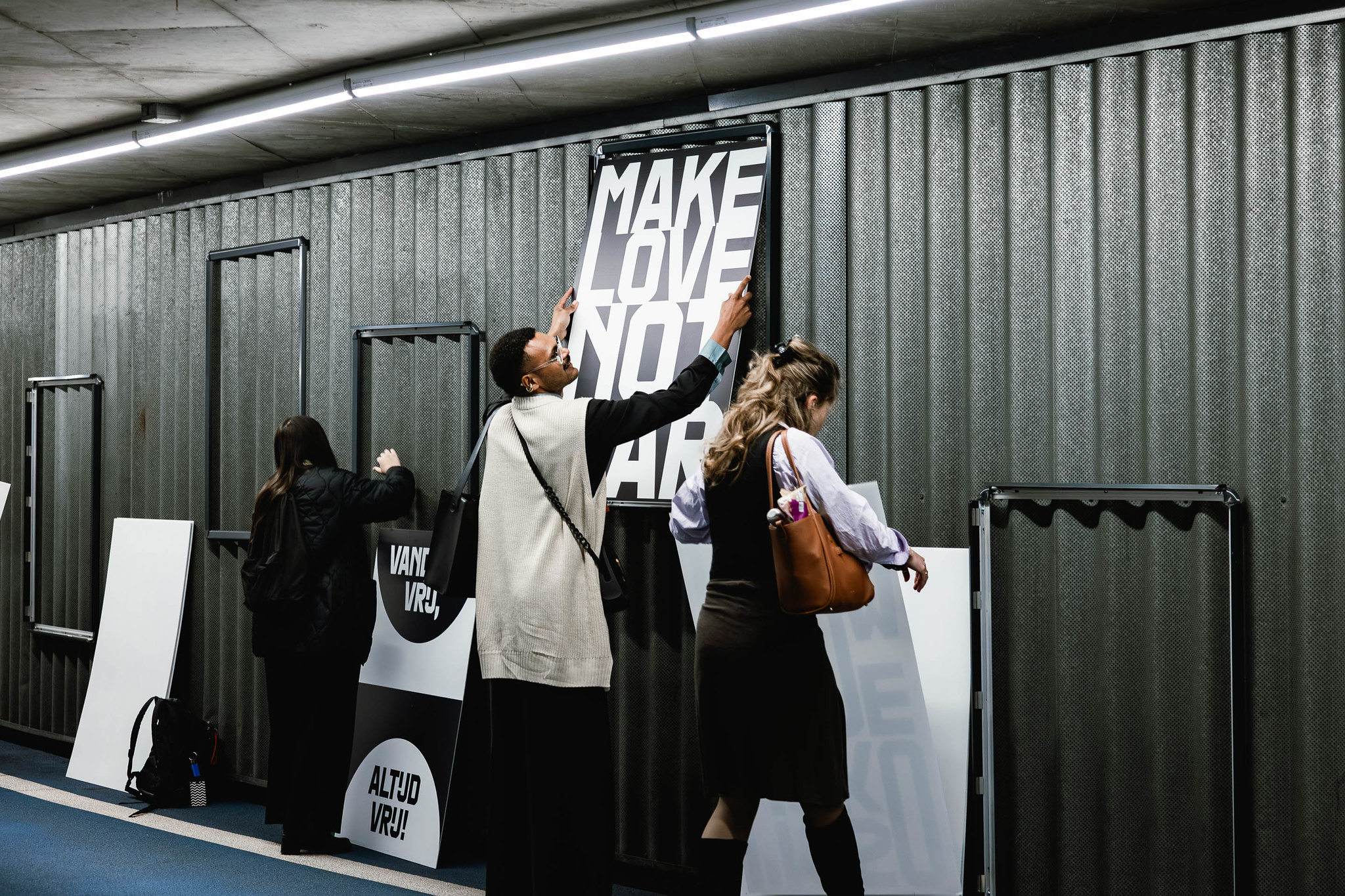
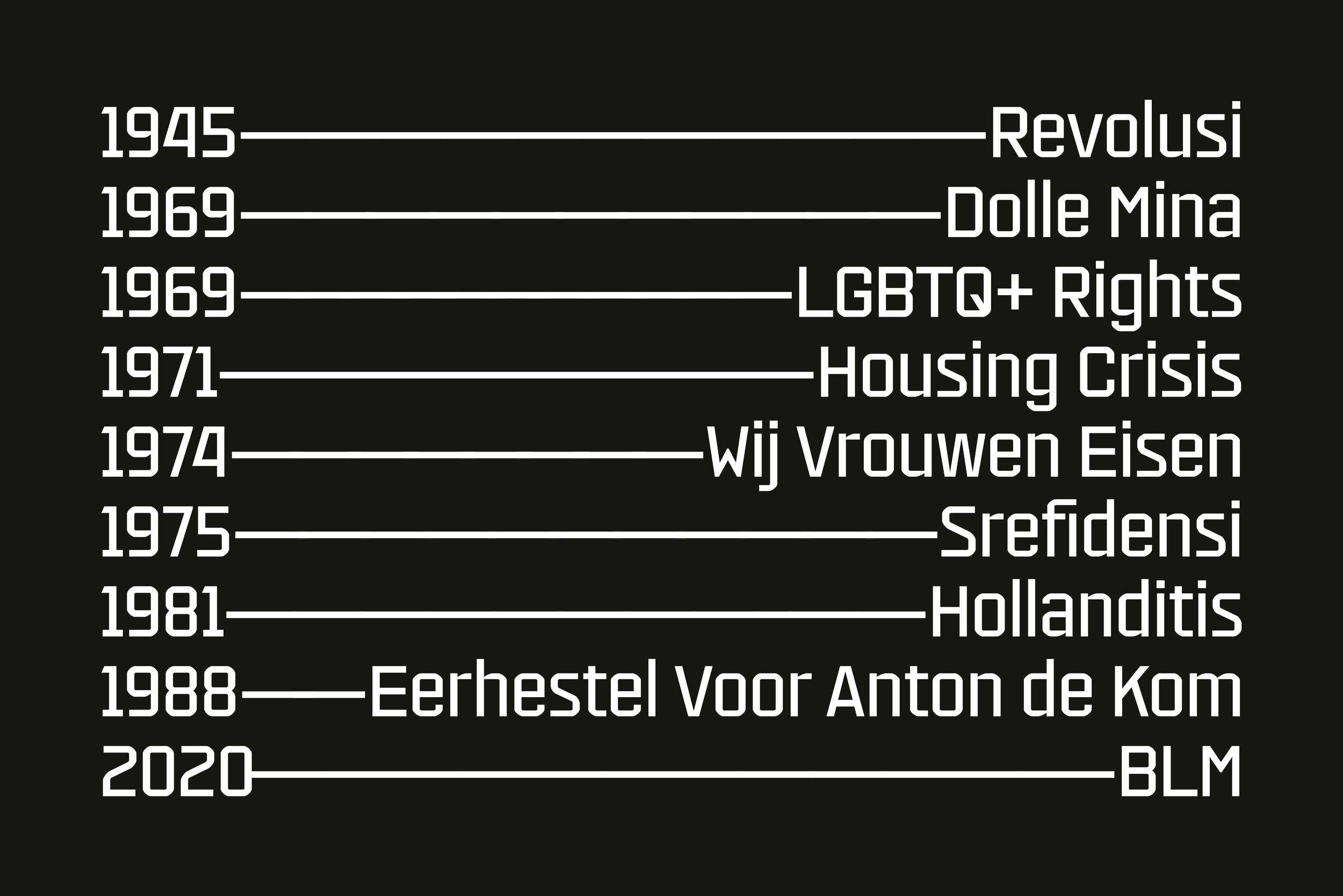
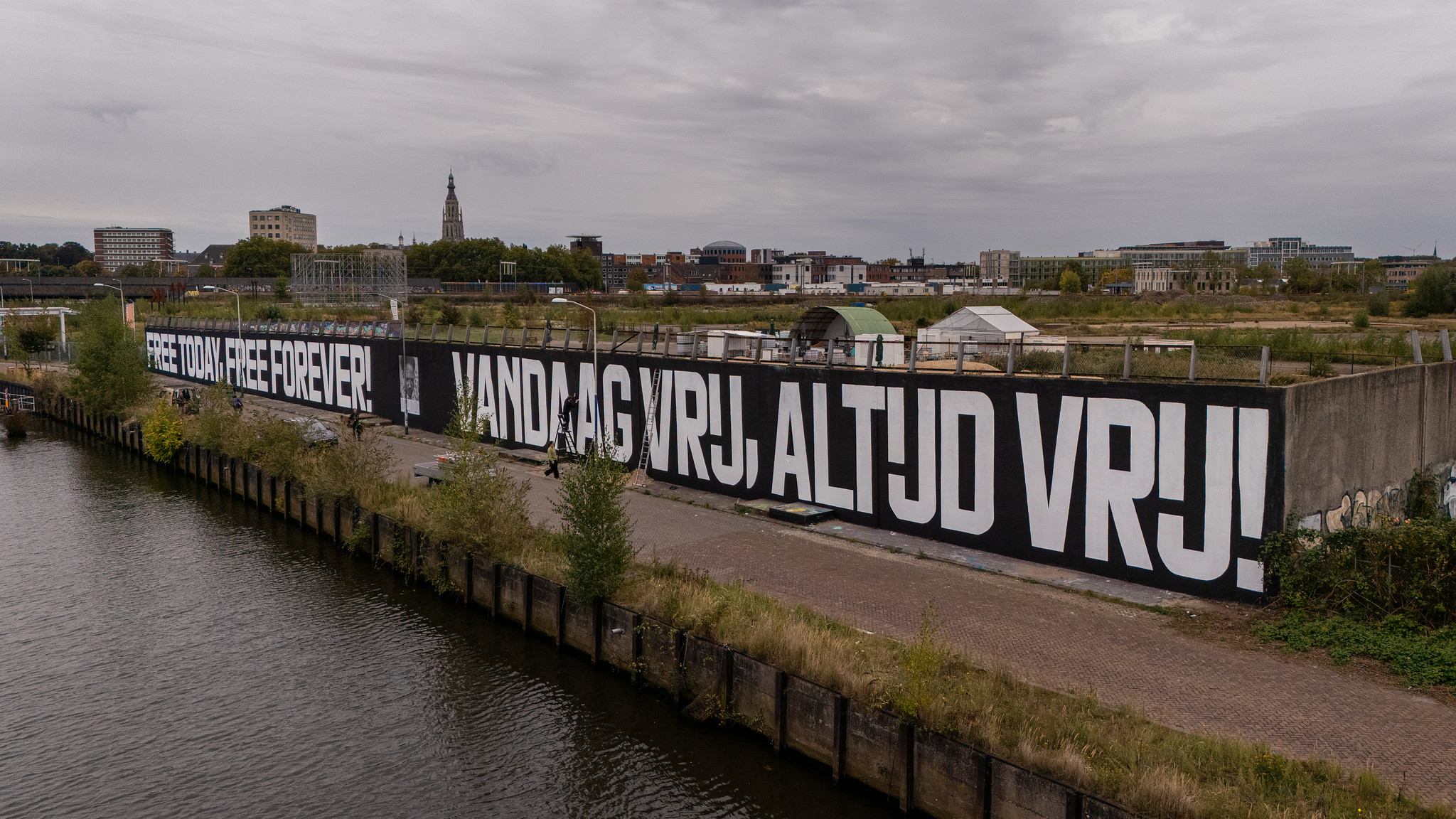
VTC Wij (‘we’ in Dutch) draws from history and in this instance, from movements across Dutch postwar history. Initially inspired by the story of Surinamese writer and anti-colonial activist, Anton de Kom (who, following his death, became a reference point in resistance and revolution history) it expanded to include and absorb other references from decades of Dutch resistance including (but not limited to) Dolle Mina (1969) – a playful but provocative Dutch feminist action group, Revolusi (1945) and Srefidensi (1975) – the struggles for independence from Dutch colonial rule and Hollanditis (1981) – a coalition of anti-military and peace groups protesting American weapons on Dutch soil. The stylistic choices and design decisions in WTC Wij, reflect again, how in typefaces the letterforms themselves are the message, this time just in Dutch. Things like a curved ‘S’ and short vertices of the ‘M’ and ‘W’ reflect how this was drawn at speed and the semi-monospaced form and Dutch single-letter ‘IJ’ digraph reflect saving space on signs.

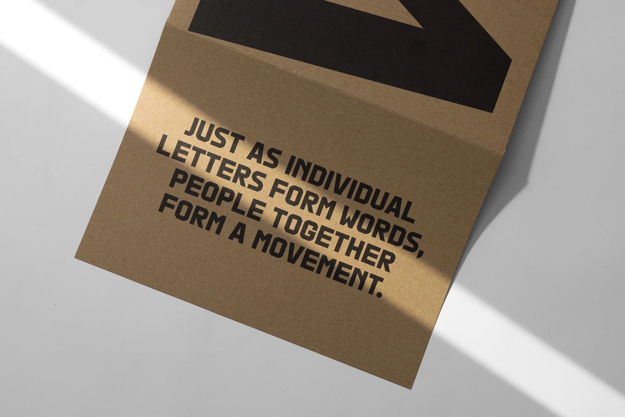
But not all typefaces are born to live a life on screen. It’s great to see a full circle moment and to see a typeface inspired and designed by activism to be used for genuine activism. In this case VTC Wij lived as a 100-meter, typeset and hand-painted mural in Breda, that spoke the declaration of Anton de Kom “VANDAAG VRIJ, ALTIJD VRIJ/“FREE TODAY, FREE FOREVER” as well as being used as part of a protest sign-making curriculum for secondary school students. As VTC Wij reflects the collective aim of change, the Characters project does so too. Over time it has developed, and changed, and made change, with new people joining the project and adding their experiences and knowledge to show what protest and making change means for them, in doing so becoming part of the Characters movement. This is perfectly, and beautifully, summarised in a quote from the team in the Characters: Voices in Type Koppermaandag print piece which reads: “just as individual letters form words, people together form a movement.”
Gil Scott-Heron proclaimed in 1977 that “The Revolution will not be Televised”, brother. His message was, and still is, clear: change won’t happen by sitting in the comfort of our homes and on your screens. Real change only happens when we come together on the streets, our voices represented through typography as although it won’t be televised, the revolution will be typeset.