CHARACTERS: Voices in Type

CHARACTERS: Voices in Type

A statement about freedom

CHARACTERS: Voices in Type connects history, design, and social change. The protest for the rehabilitation of Surinamese writer, resistance fighter, and anti-colonial activist Anton de Kom served as inspiration for a new typeface designed by Tré Seals (Vocal Type Co.). With this font, he gives De Kom’s message of resistance and solidarity a new form. Together with the designers of Civilization, we are making this visible in the city and recognizable to a new generation.

  • Power relations challenged with letters

    During climate marches, genocide protests, or feminist demonstrations, you see bright and direct handwritten signs. The letters convey emotion, urgency, and identity. The messages are part of a long tradition of typography as a means of resistance.

    As early as the French Revolution, pamphlets with crude, hastily written letters were distributed en masse to make ideas visible. Legibility and speed were more important than aesthetics. A century and a half later, something similar happened in the Civil Rights Movement in the United States. With sober capital letters on signs such as “I AM A MAN,” African-American workers claimed dignity and rights—a typography so clear that no one could ignore the message.

    In May 1968, French students and workers colored the streets of Paris with stencil prints and slogans. In the Netherlands, too, typography became a visible weapon in the 1970s and 1980s. The Dolle Mina’s used confrontational slogans to demand equality. Squatters filled the streets with posters and graffiti in raw, handmade letterforms. Anti-nuclear demonstrations and environmental movements brought hundreds of thousands of people together under short, powerful texts on signs and flags.

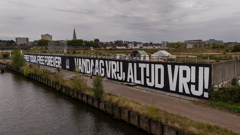
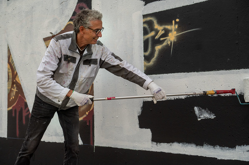
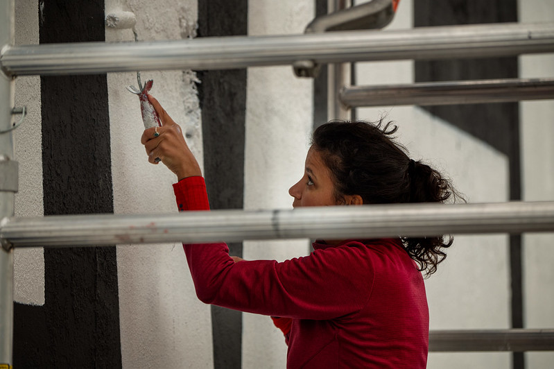
    Typography is still used for protest rallies, posters, and street art. Online, memes function as digital pamphlets: quickly made, widely distributed, and equally compelling. Unfortunately, the themes have hardly changed: equality, climate, and peace. During today’s protests, letters are once again challenging power relations.

    Just as individual letters form words, together we form a movement. Designers Tré Seals and Civilization take you through the process of VTC WIJ.

  • From MIJ to WIJ

    At the request of Graphic Matters, Tré Seals designed the font (Vocal Type Co.) VTC WIJ. He drew inspiration from the graphic world of Dutch protest culture in the 1970s and 1980s; movements concerned with the housing market, abortion and women’s rights, the independence of Suriname and Indonesia, and anti-racism.

    Protest voor eerherstel Anton de Kom – bron: The Black Archives

    The banner for the rehabilitation of Anton de Kom—a call for recognition of his legacy and contribution to Dutch and Surinamese history and acknowledgment of the injustice done to him—served as the main inspiration for the font. The text on the banner is almost monospace, which inspired the semi-mono style of WTC WIJ.

    Demonstratie Amsterdam 1976 – bron: Nationaal Archief

    The structure of the ‘IJ’ in VTC Wij was inspired by the banners of Wij Vrouwen Eisen (We Women Demand), a social action group that was active in the 1970s and 1980s and campaigned for changes to abortion legislation in the Netherlands. He also drew inspiration for details from various other banners and posters.

  • A life of resistance and solidarity

    Anton de Kom (1898–1945) was a writer, activist, and resistance fighter who spent his entire life fighting injustice. He was born in Paramaribo, Suriname, into a family that still bore the scars of slavery. In the 1920s, he moved to the Netherlands, where he joined anti-colonial and left-wing movements and spoke out against oppression and racism.

    His 1934 book Wij slaven van Suriname (We Slaves of Suriname) is considered a milestone. It was the first work to describe the history of Suriname from an anti-colonial perspective. De Kom showed that slavery was not just a thing of the past, but that inequality and racism continued to exist afterwards. In doing so, he gave voice to a history that had been ignored for too long.

    During World War II, De Kom joined the resistance. He wrote for illegal newspapers and fought against fascism. In 1944, he was arrested and deported to Germany via various camps. He died there in April 1945, shortly before liberation.

    To this day, Anton de Kom remains a source of inspiration. His work and ideals show how important it is to make stories of resistance and solidarity visible. He reminds us that freedom, equality, and representation are values we must continually strive for.

    Anton de Kom in 1930 – bron: Wikimedia Commons

  • Visible in the city

    Tre Seals and Civilization collaborated with VTC WIJ to create a design for a typographic mural. It features the quote “Free today, free forever” by Anton de Kom. This is the title of a collection of poems he wrote during World War II. In combative texts, he incorporated the history of slavery and personal poetry, with beautiful descriptions of nature, revealing his unbroken love for Suriname.

    On October 2 and 3, 2025, the text will be painted on a wall in Breda that is over 100 meters long. Anyone who identifies with this message of freedom and solidarity is welcome to join in the painting. For more information and to register, please visit this link.

    In addition to the mural, we are organizing a series of activities between October 2025 and March 2026, such as workshops for schoolchildren, a publication, an exhibition, and a conference at the Chassé Theater. More information will be available on this website at a later date.

  • Committed and dedicated

    Tré Seals’ (US) passion for creativity and storytelling is deeply rooted in his personal experiences. As a child, he drew constantly and designed graffiti names on commission for classmates. This formed the basis for his dedication to typography as a powerful form of expression and communication.

    An article titled “Black designers: still missing in action?” made him realize that design often lacks diverse perspectives and representations. He made this the central tenet of his practice. His typefaces and subsequent designs reflect and celebrate authentic cultural narratives. His thoughtful approach and sincere dedication to meaningful storytelling have earned him international recognition and collaborations with big names such as Spike Lee.

    Civilization (US) creates digital and physical experiences for fellow designers, architects, cultural institutions, and grassroots organizers. The studio draws on the history of design and activism with the aim of producing creative work that is meaningful, appealing, and distinctive. They specialize in building identity systems, campaigns, web design and development, exhibition curation and design, and experiential design. Their work focuses on communities, creates platforms, increases access to art and education, and challenges oppressive systems.

    Civilization bij Graphic Matter, 2017 – Edwin Wiekens