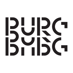
At Graphic Matters Summer School 2024, Vera was one of three masters. During a three-day masterclass, participants programmed their own browser-based design tool to generate a (typo)graphic identity.
What does typography mean to you?
“Typography is what language looks like! (That’s how Ellen Lupton’s book Thinking with Type opens).”
How has your love for type developed over the years?
“I really liked books, and wanted to learn how to design them. So I went to study graphic design at the KABK in The Hague. Whereas at first I was very bad at type design, I became more and more enamoured with typography, because it allows you to design language in very creative ways. Over the years, typography and book systems became more important in my work.”

What typifies your type?
“I like to look for the tension between legibility and illegibility. My type is at many moments unreadable and abstract and comes together at a brief moment to show the meaning. I find it interesting how form and movement can interact with meaning, and to have your gaze drawn to meaning and form at separate moments.”
What is your favourite typeface and why?
“I like fonts made by friends, because I can recognise them in the fine details.”
What fascinates you about the collaboration between technology and design?
“I find the moments where technology creates tension interesting: the crazy parts where boundaries are still undefined and things don’t quite work as they should. I also find it very important to build your own tools, and on a computer this is better done.”

How do you keep up to date with all the new technological developments?
“I read a selection of news (and also memes) every morning during my breakfast, for example https://hckrnews.com/. Many technology updates also come first on X.”
Do you still sometimes work analogue?
“Every day. I usually sketch and draw analogue before going digital, and often in between. I also knit with my hacked knitting machine, which involves a lot of physical work.”
What do you teach participants in your Summer School masterclass?
“We learned to approach typography with computation and generative design. This is cool because you get very unexpected results, and you can create your own design systems.”
Which typeface comes to mind when you think of summer?
“The font of summer 2024 is definitely a blurry Arial Narrow on lime green, after the album cover of Charli XCX’s “brat”.”


